A digital tax form challenge:
How might we…
Comply with strict new regulations on tax declaration when opening an account
Help users accurately complete the form without directing them
Respect legal language and lexicon guardrails
Eliminate the need for back-office followup to finish the application
As updated rules and regulations are introduced to Canadian banking, the Royal Bank of Canada’s Consumer Banking team is charged with implementing changes and additions to the existing flow without disrupting the user experience (and by extension, our sales targets).
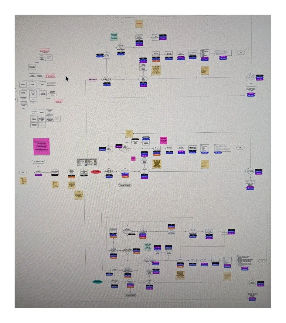
In 2021, new tax reporting regulations were handed down from the federal government that would require a coordinated redesign with broad RBC stakeholder alignment.

The business request and our design solution
Armed with a long list of technical requirements and feature requests, we led design thinking sessions to:
Dissect the current experience
Highlight crucial interactions and points of friction
Determine where new functionality would necessarily change or complicate the flow
Multiple rounds of user testing and an exploration of creative new design patterns alongside technical discussions helped us balance design and development priorities as we isolated the right solution. We focused on:
Improving clarity with language and new page elements
Preserving an intuitive, universal flow for clients and advisors
Introducing a supplemental flow for complicated cases
Ultimately, we were able to collect the necessary extra client information while preserving the user experience.
While there were still some hurdles to overcome, our legal and tax compliance stakeholders applauded our retail tax flow redesign and advocated for our squad to lead a similar effort for the business banking flows across all of RBC.
I helped lead design thinking workshops to investigate initial assumptions and define our problem with stakeholders, and then I designed and prototyped an MVP.
With the help of our UX researcher, we ran two rounds of user testing to determine exactly where the points of friction were — and how both advisors and clients would react in the moment. We discovered that:
We needed to clarify tax terms and explain where to find the info
A modal update with straightforward copy and clear action for button text would help
There was some trepidation about continuing without understanding the implications of tax answers
Advisors needed some guidance to confidently help clients in an assisted session

Key findings
With our stakeholder findings and user test results, I mocked up some wireframes with design options and content requirements and convened with our visual designer and developers.
Our task: determine how to solve for the trickiest cases, designing a component-based digital solution to evolve a mail-based process, making sure it was built and designed in a reusable manner. Moreover, the design and component architecture should be flexible enough to scale as new document upload tools became available to us.
Our updated widget prioritized three elements:
Well-placed support
Clarity above exhaustive explanation
User empowerment
To accomplish these goals, we:
Used inline CTAs, tool tips, and judiciously composed cue text to clarify official terms and involved concepts.
Designed a footer to open an info panel that could scale with resources as the widget evolves.
Carefully arranged the information hierarchy on the troubleshooting pages to ensure advisors knew what, when, and where they needed to provide more data or documentation to ensure a successful account open.

Solutions
Several months of requirement gathering and updating meant that we revisited decisions and unearthed concerns, which drew out the design and development process. We came to appreciate the power of careful design documentation and determined to be more thorough and transparent with our logs to help the group stay aligned and on track.
Our new design collected more client info without adding more pages in the flow, allowing for better data integrity and government compliance without extending the experience and risking a spike in our user drop-off rate.
Our squad collaborated with the Investment Mega Journey to re-use the widget in their flow, reducing work effort and redesign. In the week after launch, ~900 clients were able to remain in the digital experience, with ~450 completing the process and opening their TFSA without visiting a branch.
The tax widget for retail clients, with it’s proven reusable design and components, inspired a much larger project to digitally solve tax discrepancies for business banking clients across RBC — with a much more complicated flow
Impact
By actively involving our partners in all corners — product, business and legal, development and architecture — from the beginning of the design process, we were able to align on decisions quickly and resist pushback over the small content and visual details in late-stage designs. In the end, this close collaboration matured our process for the good of our project, but also for future epics that would build from our tax widget work.